Bicho do Mato
Naming, visual identity, and packaging
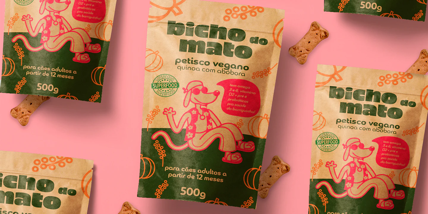
[ PT ] A Bicho do Mato é uma empresa que comercializa petiscos veganos. Se objetivo é produzir alimentos baseados em superfoods: petiscos com alto índice de proteína e vitaminas para o desempenho e imunidade dos pets.
Era necessário se diferenciar da maioria das embalagens de petiscos naturais que já existem atualmente no mercado dos pets. Também era importante que o produto fosse representado de forma leve e divertida.
O universo da marca, além do nome, identidade e embalagem, criou um personagem, com ilustrações e cores bem humoradas, trazendo ao conjunto o aspecto lúdico, leve, divertido e natural de um cãozinho tranquilo que gosta da natureza e se alimenta dela.
[ EN ] Bicho do Mato is a company that sells vegan snacks if the objective is to produce food based on superfoods: snacks with a high level of protein and vitamins for the performance and immunity of pets.
It was necessary to differentiate itself from most of the packaging of natural snacks that already exist in the pet market today. It was also important that the product was represented in a light and fun way.
The brand universe, in addition to the name, identity, and packaging, created a character, with humorous illustrations and colors, bringing to the set the playful, light, fun and natural aspect of a quiet little dog that likes nature and feeds on it.


Fonts
Piepie in the logo, Chennai in the titles and headlines and Myriad in the texts.